

在stackoverflow上看到的问题怎么给半个字符设置样式,很多大神给出了答案。我就等就来学习围观吧。
一:基本解决方案:
html:
<span class=”halfStyle” data-content=”X”>X</span>
<span class=”halfStyle” data-content=”Y”>Y</span>
<span class=”halfStyle” data-content=”Z”>Z</span>
<span class=”halfStyle” data-content=”A”>A</span>
css:
.halfStyle {
position:relative;
display:inline-block;
font-size:80px; /* or any font size will work */
color: black; /* or transparent, any color */
overflow:hidden;
white-space: pre; /* to preserve the spaces from collapsing */
}
.halfStyle:before {
display:block;
z-index:1;
position:absolute;
top:0;
left:0;
width: 50%;
content: attr(data-content); /* dynamic content for the pseudo element */
overflow:hidden;
color: #f00;
}
效果如图:
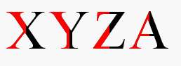
这种方法用于任何动态文本或单个字符,并且都是自动适用的。所有你需要做的就是在目标文本上添加一个class,剩下的就解决了。
同时,保留了原文的可访问性,可以被盲人或视障人士使用的屏幕阅读器识别。
单个字符的实现:
纯CSS。所有你需要做的就是把.halfStyle class用在每个你想要渲染一半样式字符的元素上。
对于每个包含字符的span元素,你可以添加一个data属性,比如data-content=”X”,并且在伪元素上使用content:attr(data-content);这样,.halfStyle:before class将会是动态的,你不需要为每个实例进行硬编码
以下其它效果自行测试了。。。
二:左右开弓,两边都设置样式
更改CSS:
.halfStyle {
position:relative;
display:inline-block;
font-size:80px; /* or any font size will work */
color: transparent; /* hide the base character */
overflow:hidden;
white-space: pre; /* to preserve the spaces from collapsing */
}
.halfStyle:before { /* creates the left part */
display:block;
z-index:1;
position:absolute;
top:0;
width: 50%;
content: attr(data-content); /* dynamic content for the pseudo element */
overflow:hidden;
pointer-events: none; /* so the base char is selectable by mouse */
color: #f00; /* for demo purposes */
text-shadow: 2px -2px 0px #af0; /* for demo purposes */
}
.halfStyle:after { /* creates the right part */
display:block;
direction: rtl; /* very important, will make the width to start from right */
position:absolute;
z-index:2;
top:0;
left:50%;
width: 50%;
content: attr(data-content); /* dynamic content for the pseudo element */
overflow:hidden;
pointer-events: none; /* so the base char is selectable by mouse */
color: #000; /* for demo purposes */
text-shadow: 2px 2px 0px #0af; /* for demo purposes */
}
三:设置水平一半的样式
CSS:
.halfStyle {
position:relative;
display:inline-block;
font-size:80px; /* or any font size will work */
color: transparent; /* hide the base character */
overflow:hidden;
white-space: pre; /* to preserve the spaces from collapsing */
}
.halfStyle:before { /* creates the top part */
display:block;
z-index:2;
position:absolute;
top:0;
height: 50%;
content: attr(data-content); /* dynamic content for the pseudo element */
overflow:hidden;
pointer-events: none; /* so the base char is selectable by mouse */
color: #f00; /* for demo purposes */
text-shadow: 2px -2px 0px #af0; /* for demo purposes */
}
.halfStyle:after { /* creates the bottom part */
display:block;
position:absolute;
z-index:1;
top:0;
height: 100%;
content: attr(data-content); /* dynamic content for the pseudo element */
overflow:hidden;
pointer-events: none; /* so the base char is selectable by mouse */
color: #000; /* for demo purposes */
text-shadow: 2px 2px 0px #0af; /* for demo purposes */
}
四:水平三分之一的样式
css:
.halfStyle { /* base char and also the bottom 1/3 */
position:relative;
display:inline-block;
font-size:80px; /* or any font size will work */
color: transparent;
overflow:hidden;
white-space: pre; /* to preserve the spaces from collapsing */
color: #f0f;
text-shadow: 2px 2px 0px #0af; /* for demo purposes */
}
.halfStyle:before { /* creates the top 1/3 */
display:block;
z-index:2;
position:absolute;
top:0;
height: 33.33%;
content: attr(data-content); /* dynamic content for the pseudo element */
overflow:hidden;
pointer-events: none; /* so the base char is selectable by mouse */
color: #f00; /* for demo purposes */
text-shadow: 2px -2px 0px #fa0; /* for demo purposes */
}
.halfStyle:after { /* creates the middle 1/3 */
display:block;
position:absolute;
z-index:1;
top:0;
height: 66.66%;
content: attr(data-content); /* dynamic content for the pseudo element */
overflow:hidden;
pointer-events: none; /* so the base char is selectable by mouse */
color: #000; /* for demo purposes */
text-shadow: 2px 2px 0px #af0; /* for demo purposes */
}
五:垂直三分之的样式
css:
.halfStyle { /* base char and also the right 1/3 */
position:relative;
display:inline-block;
font-size:80px; /* or any font size will work */
color: transparent; /* hide the base character */
overflow:hidden;
white-space: pre; /* to preserve the spaces from collapsing */
color: #f0f; /* for demo purposes */
text-shadow: 2px 2px 0px #0af; /* for demo purposes */
}
.halfStyle:before { /* creates the left 1/3 */
display:block;
z-index:2;
position:absolute;
top:0;
width: 33.33%;
content: attr(data-content); /* dynamic content for the pseudo element */
overflow:hidden;
pointer-events: none; /* so the base char is selectable by mouse */
color: #f00; /* for demo purposes */
text-shadow: 2px -2px 0px #af0; /* for demo purposes */
}
.halfStyle:after { /* creates the middle 1/3 */
display:block;
z-index:1;
position:absolute;
top:0;
width: 66.66%;
content: attr(data-content); /* dynamic content for the pseudo element */
overflow:hidden;
pointer-events: none; /* so the base char is selectable by mouse */
color: #000; /* for demo purposes */
text-shadow: 2px 2px 0px #af0; /* for demo purposes */
}