

使用media来判断屏幕宽度遇到的问题:
ios上当我旋转屏幕的时候可行,但是安卓机上没反应,横屏显示的还是我竖屏的样式。
查了一下资料,css3的media如果要在移动端有较好的显示效果,需要在页头加上这段代码
<meta name="viewport" content="width=device-width, initial-scale=1.0, maximum-scale=1.0, user-scalable=no">
可是这段代码我不能用。因为我的页面是做了适配的。可以根据屏幕的大小来显示字号和样式的大小。如果我加了这段代码的话,我的适配就不能用了。所以要用其他方法
解决办法:
移动端的设备提供了一个事件:orientationChange事件
这个事件是苹果公司为safari中添加的。以便开发人员能够确定用户何时将设备由横向查看切换为纵向查看模式。
在设备旋转的时候,会触发这个事件,
// Listen for orientation changes window.addEventListener("orientationchange", function() { // Announce the new orientation number alert(window.orientation); }, false);
只要用户改变了设备的查看模式,就会触发 orientationChange事件。此时的event对象不包含任何有价值的信息,
因为唯一相关信息可以通过window.orientation访问到
orientation属性
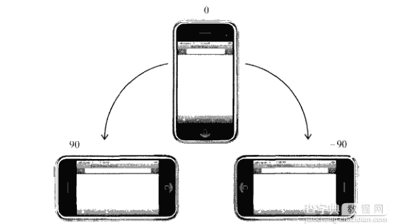
它有三个值:0,90,-90
0为竖屏模式(portrait),-90意味着该设备横向旋转到右侧的横屏模式(landscape),而90表示该设备是横向旋转到左边的横屏模式(landscape)。
还有一个是180,表示竖屏但是是翻转过来的竖屏模式。但这种模式至今尚未得到支持。
如图所示:
因此,结合这个orientationChange事件和window的orientation属性,我们就比较好判断设备是处于横屏还是竖屏了
(function(){ var init = function(){ var updateOrientation = function(){ var orientation = window.orientation; switch(orientation){ case 90: case -90: orientation = 'landscape'; //这里是横屏 break; default: orientation = 'portrait'; //这里是竖屏 break; } //html根据不同的旋转状态,加上不同的class,横屏加上landscape,竖屏 //加上portrait document.body.parentNode.setAttribute('class',orientation); }; // 每次旋转,调用这个事件。 window.addEventListener('orientationchange',updateOrientation,false); // 事件的初始化 updateOrientation(); }; window.addEventListener('DOMContentLoaded',init,false); })();
因此可以根据不同的旋转状态加上class,所以我们的css就可以这样写了
/**竖屏 body显示红色**/ .portrait body div{ background: red; } /**横屏 body显示蓝色**/ .landscape body div{ background: blue; }
另外一种写法是,借助 media queries
@media all and (orientation: portrait) { body div {background: red;} } @media all and (orientation: landscape) { body div {background: blue; } }
这个orientation media query 在ios3.2+和安卓2.0+上还有其他浏览器上有效。
相对来说,这种代码更加的简洁一点。跟上面的js+css,这种代码是纯css。当设备旋转的时候,就会根据设备旋转的方向来调用改方向的css
兼容性
有些设备并没有提供orientationchange事件,但不触发窗口的resize事件。并且media queries也不支持的情况下,我们该怎么办呢?
可以用resize事件来判断。用innerWidth , innerHeight,可以检索得到屏幕大小。依据宽和高的大小比较判断,宽小于高为竖屏,宽大与高就是横屏。
代码如下:
(function(){ var updateOrientation = function(){ var orientation = (window.innerWidth > window.innerHeight) ? 'landscape' : 'portrait'; document.body.parentNode.setAttribute('class',orientation); }; var init = function(){ updateOrientation(); //监听resize事件 window.addEventListener('resize',updateOrientation,false); }; window.addEventListener('DOMContentLoaded',init,false); })();
这样,我们就可以在浏览器中看到屏幕旋转带来样式的变化了。
两种检测方法的结合,代码如下:
(function(){ var supportOrientation = (typeof window.orientation === 'number' && typeof window.onorientationchange === 'object'); var init = function(){ var htmlNode = document.body.parentNode, orientation; var updateOrientation = function(){ if(supportOrientation){ orientation = window.orientation; switch(orientation){ case 90: case -90: orientation = 'landscape'; break; default: orientation = 'portrait'; break; } }else{ orientation = (window.innerWidth > window.innerHeight) ? 'landscape' : 'portrait'; } htmlNode.setAttribute('class',orientation); }; if(supportOrientation){ window.addEventListener('orientationchange',updateOrientation,false); }else{ //监听resize事件 window.addEventListener('resize',updateOrientation,false); } updateOrientation(); }; window.addEventListener('DOMContentLoaded',init,false); })();
利用这个方法,就可以解决掉烦人的移动端设备横竖屏的检测了。