

一、基础
很多的Android入门程序猿来说对于Android自定义View,可能都是比较恐惧的,但是这又是高手进阶的必经之路,所有准备在自定义View上面花一些功夫,多写一些文章。先总结下自定义View的步骤:
1、自定义View的属性
2、在View的构造方法中获得我们自定义的属性
3、重写onMesure
4、重写onDraw
我把3用[]标出了,所以说3不一定是必须的,当然了大部分情况下还是需要重写的。
1、自定义View的属性,首先在res/values/ 下建立一个attrs.xml , 在里面定义我们的属性和声明我们的整个样式。
<"1.0" encoding="utf-8"?> <resources> <attr name="titleText" format="string" /> <attr name="titleTextColor" format="color" /> <attr name="titleTextSize" format="dimension" /> <declare-styleable name="CustomTitleView"> <attr name="titleText" /> <attr name="titleTextColor" /> <attr name="titleTextSize" /> </declare-styleable> </resources>
我们定义了字体,字体颜色,字体大小3个属性,format是值该属性的取值类型:
一共有:string,color,demension,integer,enum,reference,float,boolean,fraction,flag;不清楚的可以google一把。
然后在布局中声明我们的自定义View
<RelativeLayout xmlns:android="http://schemas.android.com/apk/res/android" xmlns:tools="http://schemas.android.com/tools" xmlns:custom="http://schemas.android.com/apk/res/com.example.customview01" android:layout_width="match_parent" android:layout_height="match_parent" > <com.example.customview01.view.CustomTitleView android:layout_width="200dp" android:layout_height="100dp" custom:titleText="3712" custom:titleTextColor="#ff0000" custom:titleTextSize="40sp" /> </RelativeLayout>
一定要引入 xmlns:custom="http://schemas.android.com/apk/res/com.example.customview01"我们的命名空间,后面的包路径指的是项目的package
2、在View的构造方法中,获得我们的自定义的样式
/** * 文本 */ private String mTitleText; /** * 文本的颜色 */ private int mTitleTextColor; /** * 文本的大小 */ private int mTitleTextSize; /** * 绘制时控制文本绘制的范围 */ private Rect mBound; private Paint mPaint; public CustomTitleView(Context context, AttributeSet attrs) { this(context, attrs, 0); } public CustomTitleView(Context context) { this(context, null); } /** * 获得我自定义的样式属性 * * @param context * @param attrs * @param defStyle */ public CustomTitleView(Context context, AttributeSet attrs, int defStyle) { super(context, attrs, defStyle); /** * 获得我们所定义的自定义样式属性 */ TypedArray a = context.getTheme().obtainStyledAttributes(attrs, R.styleable.CustomTitleView, defStyle, 0); int n = a.getIndexCount(); for (int i = 0; i < n; i++) { int attr = a.getIndex(i); switch (attr) { case R.styleable.CustomTitleView_titleText: mTitleText = a.getString(attr); break; case R.styleable.CustomTitleView_titleTextColor: // 默认颜色设置为黑色 mTitleTextColor = a.getColor(attr, Color.BLACK); break; case R.styleable.CustomTitleView_titleTextSize: // 默认设置为16sp,TypeValue也可以把sp转化为px mTitleTextSize = a.getDimensionPixelSize(attr, (int) TypedValue.applyDimension( TypedValue.COMPLEX_UNIT_SP, 16, getResources().getDisplayMetrics())); break; } } a.recycle(); /** * 获得绘制文本的宽和高 */ mPaint = new Paint(); mPaint.setTextSize(mTitleTextSize); // mPaint.setColor(mTitleTextColor); mBound = new Rect(); mPaint.getTextBounds(mTitleText, 0, mTitleText.length(), mBound); }
我们重写了3个构造方法,默认的布局文件调用的是两个参数的构造方法,所以记得让所有的构造调用我们的三个参数的构造,我们在三个参数的构造中获得自定义属性。
3、我们重写onDraw,onMesure调用系统提供的:
@Override protected void onMeasure(int widthMeasureSpec, int heightMeasureSpec) { super.onMeasure(widthMeasureSpec, heightMeasureSpec); } @Override protected void onDraw(Canvas canvas) { mPaint.setColor(Color.YELLOW); canvas.drawRect(0, 0, getMeasuredWidth(), getMeasuredHeight(), mPaint); mPaint.setColor(mTitleTextColor); canvas.drawText(mTitleText, getWidth() / 2 - mBound.width() / 2, getHeight() / 2 + mBound.height() / 2, mPaint); }
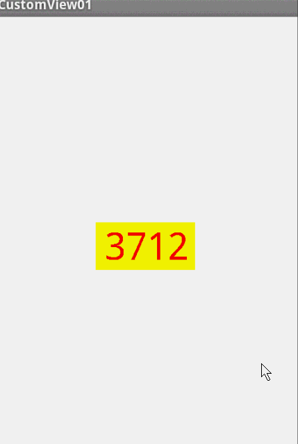
此时的效果是:
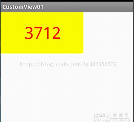
是不是觉得还不错,基本已经实现了自定义View。但是此时如果我们把布局文件的宽和高写成wrap_content,会发现效果并不是我们的预期:
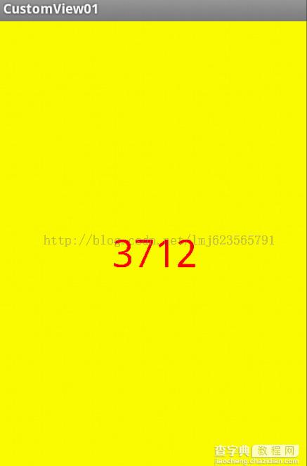
系统帮我们测量的高度和宽度都是MATCH_PARNET,当我们设置明确的宽度和高度时,系统帮我们测量的结果就是我们设置的结果,当我们设置为WRAP_CONTENT,或者MATCH_PARENT系统帮我们测量的结果就是MATCH_PARENT的长度。
所以,当设置了WRAP_CONTENT时,我们需要自己进行测量,即重写onMesure方法”:
重写之前先了解MeasureSpec的specMode,一共三种类型:
EXACTLY:一般是设置了明确的值或者是MATCH_PARENT
AT_MOST:表示子布局限制在一个最大值内,一般为WARP_CONTENT
UNSPECIFIED:表示子布局想要多大就多大,很少使用
下面是我们重写onMeasure代码:
@Override protected void onMeasure(int widthMeasureSpec, int heightMeasureSpec) { int widthMode = MeasureSpec.getMode(widthMeasureSpec); int widthSize = MeasureSpec.getSize(widthMeasureSpec); int heightMode = MeasureSpec.getMode(heightMeasureSpec); int heightSize = MeasureSpec.getSize(heightMeasureSpec); int width; int height ; if (widthMode == MeasureSpec.EXACTLY) { width = widthSize; } else { mPaint.setTextSize(mTitleTextSize); mPaint.getTextBounds(mTitle, 0, mTitle.length(), mBounds); float textWidth = mBounds.width(); int desired = (int) (getPaddingLeft() + textWidth + getPaddingRight()); width = desired; } if (heightMode == MeasureSpec.EXACTLY) { height = heightSize; } else { mPaint.setTextSize(mTitleTextSize); mPaint.getTextBounds(mTitle, 0, mTitle.length(), mBounds); float textHeight = mBounds.height(); int desired = (int) (getPaddingTop() + textHeight + getPaddingBottom()); height = desired; } setMeasuredDimension(width, height); }
现在我们修改下布局文件:
<RelativeLayout xmlns:android="http://schemas.android.com/apk/res/android" xmlns:tools="http://schemas.android.com/tools" xmlns:custom="http://schemas.android.com/apk/res/com.example.customview01" android:layout_width="match_parent" android:layout_height="match_parent" > <com.example.customview01.view.CustomTitleView android:layout_width="wrap_content" android:layout_height="wrap_content" custom:titleText="3712" android:padding="10dp" custom:titleTextColor="#ff0000" android:layout_centerInParent="true" custom:titleTextSize="40sp" /> </RelativeLayout>
现在的效果是:
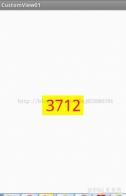
完全复合我们的预期,现在我们可以对高度、宽度进行随便的设置了,基本可以满足我们的需求。
当然了,这样下来我们这个自定义View与TextView相比岂不是没什么优势,所有我们觉得给自定义View添加一个事件:
在构造中添加:
this.setOnClickListener(new OnClickListener() { @Override public void onClick(View v) { mTitleText = randomText(); postInvalidate(); } }); private String randomText() { Random random = new Random(); Set<Integer> set = new HashSet<Integer>(); while (set.size() < 4) { int randomInt = random.nextInt(10); set.add(randomInt); } StringBuffer sb = new StringBuffer(); for (Integer i : set) { sb.append("" + i); } return sb.toString(); }
下面再来运行:
我们添加了一个点击事件,每次让它随机生成一个4位的随机数,有兴趣的可以在onDraw中添加一点噪点,然后改写为验证码,是不是感觉很不错。
进阶
前面已经介绍过一个自定义View的基础的例子,下面给大家带来一个稍微复杂点的例子。
自定义View显示一张图片,下面包含图片的文本介绍,类似相片介绍什么的,不过不重要,主要是学习自定义View的用法么。
直接切入正题:
1、在res/values/attr.xml
<"1.0" encoding="utf-8"?> <resources> <attr name="titleText" format="string" /> <attr name="titleTextSize" format="dimension" /> <attr name="titleTextColor" format="color" /> <attr name="image" format="reference" /> <attr name="imageScaleType"> <enum name="fillXY" value="0" /> <enum name="center" value="1" /> </attr> <declare-styleable name="CustomImageView"> <attr name="titleText" /> <attr name="titleTextSize" /> <attr name="titleTextColor" /> <attr name="image" /> <attr name="imageScaleType" /> </declare-styleable> </resources>
2、在构造中获得我们的自定义属性:
/** * 初始化所特有自定义类型 * * @param context * @param attrs * @param defStyle */ public CustomImageView(Context context, AttributeSet attrs, int defStyle) { super(context, attrs, defStyle); TypedArray a = context.getTheme().obtainStyledAttributes(attrs, R.styleable.CustomImageView, defStyle, 0); int n = a.getIndexCount(); for (int i = 0; i < n; i++) { int attr = a.getIndex(i); switch (attr) { case R.styleable.CustomImageView_image: mImage = BitmapFactory.decodeResource(getResources(), a.getResourceId(attr, 0)); break; case R.styleable.CustomImageView_imageScaleType: mImageScale = a.getInt(attr, 0); break; case R.styleable.CustomImageView_titleText: mTitle = a.getString(attr); break; case R.styleable.CustomImageView_titleTextColor: mTextColor = a.getColor(attr, Color.BLACK); break; case R.styleable.CustomImageView_titleTextSize: mTextSize = a.getDimensionPixelSize(attr, (int) TypedValue.applyDimension(TypedValue.COMPLEX_UNIT_SP, 16, getResources().getDisplayMetrics())); break; } } a.recycle(); rect = new Rect(); mPaint = new Paint(); mTextBound = new Rect(); mPaint.setTextSize(mTextSize); // 计算了描绘字体需要的范围 mPaint.getTextBounds(mTitle, 0, mTitle.length(), mTextBound); }
3、重写onMeasure
@Override protected void onMeasure(int widthMeasureSpec, int heightMeasureSpec) { // super.onMeasure(widthMeasureSpec, heightMeasureSpec); /** * 设置宽度 */ int specMode = MeasureSpec.getMode(widthMeasureSpec); int specSize = MeasureSpec.getSize(widthMeasureSpec); if (specMode == MeasureSpec.EXACTLY)// match_parent , accurate { Log.e("xxx", "EXACTLY"); mWidth = specSize; } else { // 由图片决定的宽 int desireByImg = getPaddingLeft() + getPaddingRight() + mImage.getWidth(); // 由字体决定的宽 int desireByTitle = getPaddingLeft() + getPaddingRight() + mTextBound.width(); if (specMode == MeasureSpec.AT_MOST)// wrap_content { int desire = Math.max(desireByImg, desireByTitle); mWidth = Math.min(desire, specSize); Log.e("xxx", "AT_MOST"); } } /*** * 设置高度 */ specMode = MeasureSpec.getMode(heightMeasureSpec); specSize = MeasureSpec.getSize(heightMeasureSpec); if (specMode == MeasureSpec.EXACTLY)// match_parent , accurate { mHeight = specSize; } else { int desire = getPaddingTop() + getPaddingBottom() + mImage.getHeight() + mTextBound.height(); if (specMode == MeasureSpec.AT_MOST)// wrap_content { mHeight = Math.min(desire, specSize); } } setMeasuredDimension(mWidth, mHeight); }
4、重写onDraw
@Override protected void onDraw(Canvas canvas) { // super.onDraw(canvas); /** * 边框 */ mPaint.setStrokeWidth(4); mPaint.setStyle(Paint.Style.STROKE); mPaint.setColor(Color.CYAN); canvas.drawRect(0, 0, getMeasuredWidth(), getMeasuredHeight(), mPaint); rect.left = getPaddingLeft(); rect.right = mWidth - getPaddingRight(); rect.top = getPaddingTop(); rect.bottom = mHeight - getPaddingBottom(); mPaint.setColor(mTextColor); mPaint.setStyle(Style.FILL); /** * 当前设置的宽度小于字体需要的宽度,将字体改为xxx... */ if (mTextBound.width() > mWidth) { TextPaint paint = new TextPaint(mPaint); String msg = TextUtils.ellipsize(mTitle, paint, (float) mWidth - getPaddingLeft() - getPaddingRight(), TextUtils.TruncateAt.END).toString(); canvas.drawText(msg, getPaddingLeft(), mHeight - getPaddingBottom(), mPaint); } else { //正常情况,将字体居中 canvas.drawText(mTitle, mWidth / 2 - mTextBound.width() * 1.0f / 2, mHeight - getPaddingBottom(), mPaint); } //取消使用掉的快 rect.bottom -= mTextBound.height(); if (mImageScale == IMAGE_SCALE_FITXY) { canvas.drawBitmap(mImage, null, rect, mPaint); } else { //计算居中的矩形范围 rect.left = mWidth / 2 - mImage.getWidth() / 2; rect.right = mWidth / 2 + mImage.getWidth() / 2; rect.top = (mHeight - mTextBound.height()) / 2 - mImage.getHeight() / 2; rect.bottom = (mHeight - mTextBound.height()) / 2 + mImage.getHeight() / 2; canvas.drawBitmap(mImage, null, rect, mPaint); } }
代码,结合注释和基础部分View的使用,应该可以看懂,不明白的留言。下面我们引入我们的自定义View:
<LinearLayout xmlns:android="http://schemas.android.com/apk/res/android" xmlns:tools="http://schemas.android.com/tools" xmlns:zhy="http://schemas.android.com/apk/res/com.zhy.customview02" android:layout_width="match_parent" android:layout_height="match_parent" android:orientation="vertical" > <com.zhy.customview02.view.CustomImageView android:layout_width="wrap_content" android:layout_height="wrap_content" android:layout_margin="10dp" android:padding="10dp" zhy:image="@drawable/ic_launcher" zhy:imageScaleType="center" zhy:titleText="hello andorid ! " zhy:titleTextColor="#ff0000" zhy:titleTextSize="30sp" /> <com.zhy.customview02.view.CustomImageView android:layout_width="100dp" android:layout_height="wrap_content" android:layout_margin="10dp" android:padding="10dp" zhy:image="@drawable/ic_launcher" zhy:imageScaleType="center" zhy:titleText="helloworldwelcome" zhy:titleTextColor="#00ff00" zhy:titleTextSize="20sp" /> <com.zhy.customview02.view.CustomImageView android:layout_width="wrap_content" android:layout_height="wrap_content" android:layout_margin="10dp" android:padding="10dp" zhy:image="@drawable/lmj" zhy:imageScaleType="center" zhy:titleText="妹子~" zhy:titleTextColor="#ff0000" zhy:titleTextSize="12sp" /> </LinearLayout>
我特意让显示出现3中情况:
1、字体的宽度大于图片,且View宽度设置为wrap_content
2、View宽度设置为精确值,字体的长度大于此宽度
3、图片的宽度大于字体,且View宽度设置为wrap_content
看看显示效果:
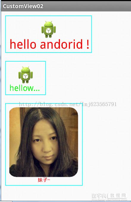
怎么样,对于这三种情况所展示的效果都还不错吧。