

ToggleButton(开关按钮)和Switch(开关)讲解:
一、核心属性讲解:
(1)ToggleButton
textOn:按钮被选中的时候文字显示
textOff:按钮没有被选中的时候文字显示
ToggleButton的状态只能是选中和未选中,并且需要为不同的状态设置不同的显示文本。
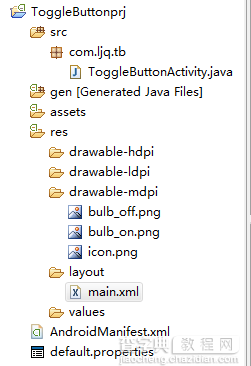
以下案例为ToggleButton的用法
目录结构
main.xml布局文件
<"1.0" encoding="utf-8"?> <LinearLayout xmlns:android="http://schemas.android.com/apk/res/android" android:orientation="vertical" android:layout_width="fill_parent" android:layout_height="fill_parent"> <ImageView android:id="@+id/imageView" android:layout_width="wrap_content" android:layout_height="wrap_content" android:src="@drawable/bulb_off" android:layout_gravity="center_horizontal" /> <ToggleButton android:id="@+id/toggleButton" android:layout_width="140dip" android:layout_height="wrap_content" android:textOn="开灯" android:textOff="关灯" android:layout_gravity="center_horizontal" /> </LinearLayout>
ToggleButtonActivity类
package com.ljq.tb; import android.app.Activity; import android.os.Bundle; import android.widget.CompoundButton; import android.widget.ImageView; import android.widget.ToggleButton; import android.widget.CompoundButton.OnCheckedChangeListener; public class ToggleButtonActivity extends Activity { private ImageView imageView=null; private ToggleButton toggleButton=null; @Override public void onCreate(Bundle savedInstanceState) { super.onCreate(savedInstanceState); setContentView(R.layout.main); imageView=(ImageView) findViewById(R.id.imageView); toggleButton=(ToggleButton)findViewById(R.id.toggleButton); toggleButton.setOnCheckedChangeListener(new OnCheckedChangeListener(){ public void onCheckedChanged(CompoundButton buttonView, boolean isChecked) { toggleButton.setChecked(isChecked); imageView.setImageResource(isChecked?R.drawable.bulb_on:R.drawable.bulb_off); } }); } }
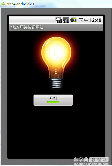
运行效果:
(2)switch:
showText:设置textOn/off的时候文字是否显示
android:showText:设置on/off的时候是否显示文字,boolean
android:splitTrack:是否设置一个间隙,让滑块与底部图片分隔,boolean
android:switchMinWidth:设置开关的最小宽度
android:switchPadding:设置滑块内文字的间隔
android:textOff:按钮没有被选中时显示的文字
android:textOn:按钮被选中时显示的文字
android:textStyle:文字风格,粗体,斜体写划线那些
android:track:底部的图片
android:thumb:滑块的图片
可以自己动手试一试每一个属性
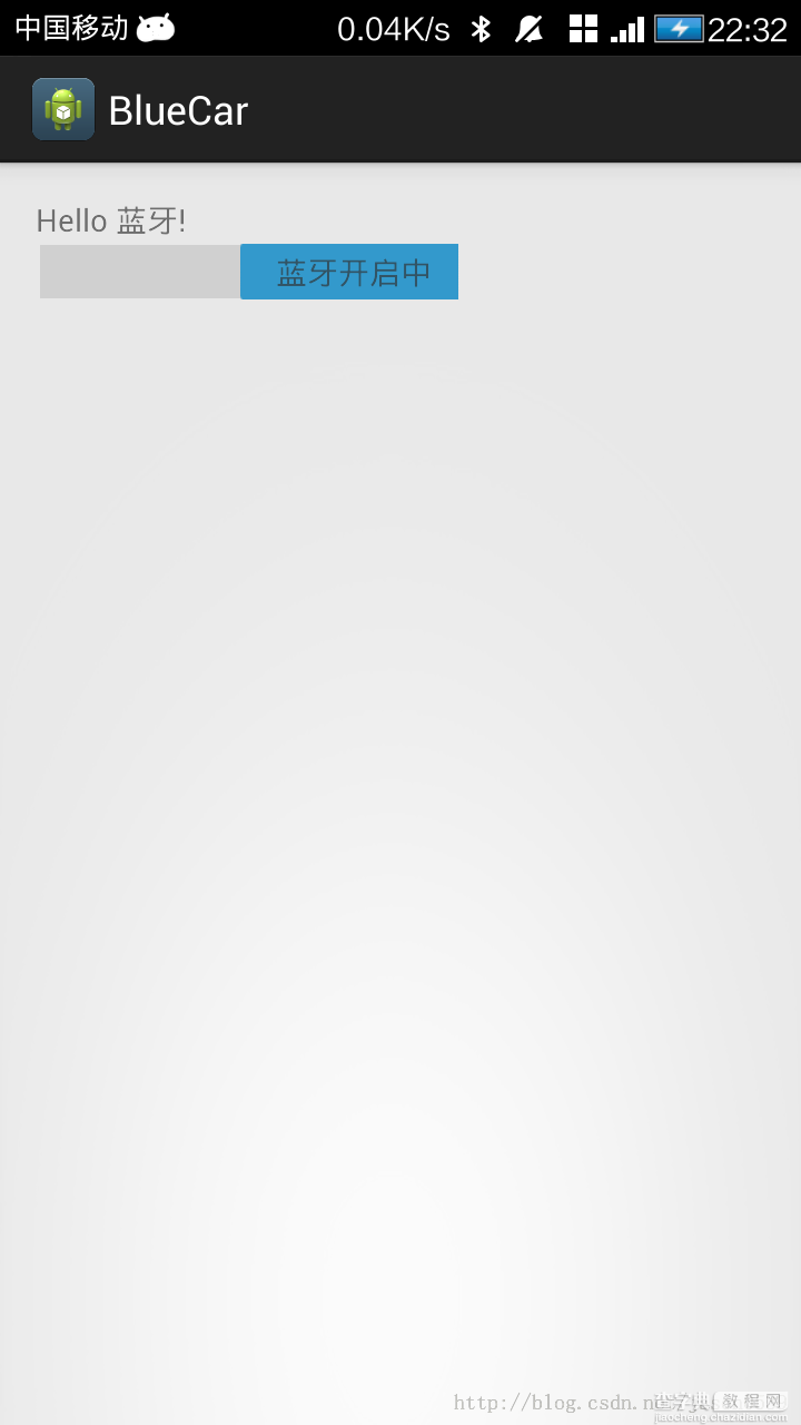
在做一个蓝牙开关时候,用到了switch,记一下用法,其实跟Button是几乎一样的.
布局中:
<Switch android:id="@+id/open" android:layout_width="wrap_content" android:layout_height="wrap_content" android:textOff="蓝牙关闭中" android:textOn="蓝牙开启中" />
java代码中
open.setOnCheckedChangeListener(new OnCheckedChangeListener() { @Override public void onCheckedChanged(CompoundButton buttonView, boolean isChecked) { // TODO Auto-generated method stub if (isChecked) { mBluetoothAdapter.enable();//打开蓝牙 } else { mBluetoothAdapter.disable();// 关闭蓝牙 } } });
就是这样了,一看就明白了.